Adj.1.bra-zen – to be
unrestrained by convention or propriety ; tran·si·tion. - 1. Passage from one form, state, style, or place to another. Brazen
transitions draws inspiration from my personal environment, looking directly at
the public stairs that go pass my window and the weird and wonderful who use
the transitional space. Drug addicts, homeless, business suits, school kids, a
brazen coalescence of personalities all use this space day to day, merely an unconsidered
blip on their journey. I wanted to capture the essence of this clash of
characters and simulate their common connection of these structural stairs. I paralleled
this idea with the visual metaphor of graffiti, which covers the area in which
I live. I looked at how graffiti is a ‘mark’ of personality on the space and
how these people are metaphorically and unconscious ‘colouring’ the steps as
they use them.
My collection uses the stairs as a
structural framework for my designs, drawing from the linear makeup and
simplifying it down into geometric shapes. The people are mostly referenced
through the colour, in which I chose bright and clashing colours taken directly
from the crazy outfits and also from the grafitti. I didn’t want a literal
interpretation of graffiti but rather draw from the important aspects, the
colour, the expressive quality and the texture. I have brought in the
‘personalities’ through abstract prints and subtle detailing, such as
embroidered ‘crack whore’ on a collar. The details are slightly hidden and
unexpected, I wanted them to be intriguing and add a bit of humour. I feel this
works well for my target market, it is classic, with a subtle quirk, making the
collection more contemporary. I am targeting the higher mid-market
segment. I want the collection to be desirable but also accessible,
incorporating investment pieces, with less expensive items, for those who want
smaller items that still carry the concept and design elements of the
collection. The items can be mixed and matched to be as flamboyant or
conservative as the consumer feels comfortable with. I am
becoming increasingly interested in the idea of fast versus slow fashion. I
wanted to contrast this idea of the constantly changing movement in the space
with using slow fashion, as I believe it is going to be a real issue in the
future. All the garments I created are to be worn for many seasons, designs
that are interchangeable and beautifully crafted.
Sustainability was an important
aspect I explored in this collection. I knew from the outset I wanted to use
sustainable fabrics, which is necessary, but a little bit obvious, I wanted to
look at sustainability through the design processes as well as the manufacture.
My collection incorporates the idea of user participation to create unique
outfits from a select amount of garments, some sustainably made, others
transformable or reversible and one, zero waste. I was thinking about why
consumers buy so many items of clothing, to look different, to have many
different outfits, resulting in many different garments. Solution. Having
single garments that can be transformed in to something new, and elements that
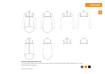
can be removed and replaced. I designed 3 jackets and one dress with this
transformable element, all connected with zips and with universal sleeves. This
transformable aspect also tackles the change in season, although this is an
Autumn/Winter collection, the jackets have removable sleeves which make them
suitable year round. I also have reversible garments, t-shirts and a dress,
featuring my signature triangle print and block colours. Finally I produced a
zero waste dress, starting with the framework of the triangles, I used Julian
Roberts subtraction and plug whole technique to replace the cut outs with the
three dimensional triangle patterns. Brazen Transitions is a sustainable
collection that can be worn by anyone, greeny or not, it represents
sustainability in a way that makes it accessible to the mid market consumer,
providing desirable and practical garments and outfits which they can have for
years to come.
Brazen Transitions looks towards
the future in a sustainable way. I want the collection to be able to sit beside
others, that may or may not be sustainable, and act as a step in the
realignment of the fashion industry towards a sustainable existence.